Learning management system
Industry
Ed-tech
Org
Internshala
Role
UX & UI Designer
Team members
N/A
Redesigned a student-facing LMS to reduce drop-offs by clarifying progress, simplifying navigation, and supporting interrupted learning.
Reframed the LMS from a content viewer into a guided learning system.
Resulted in a 12% increase in course completion and improved learner confidence.
My Role
I owned the end-to-end learner experience. From defining navigation logic and progress models to designing interruption-friendly learning flows. I partnered with PMs and engineers to translate learning friction into scalable system decisions.

Problem
Despite strong content, learners were dropping off — not because they couldn’t learn, but because the system didn’t help them continue.
Key issues included:
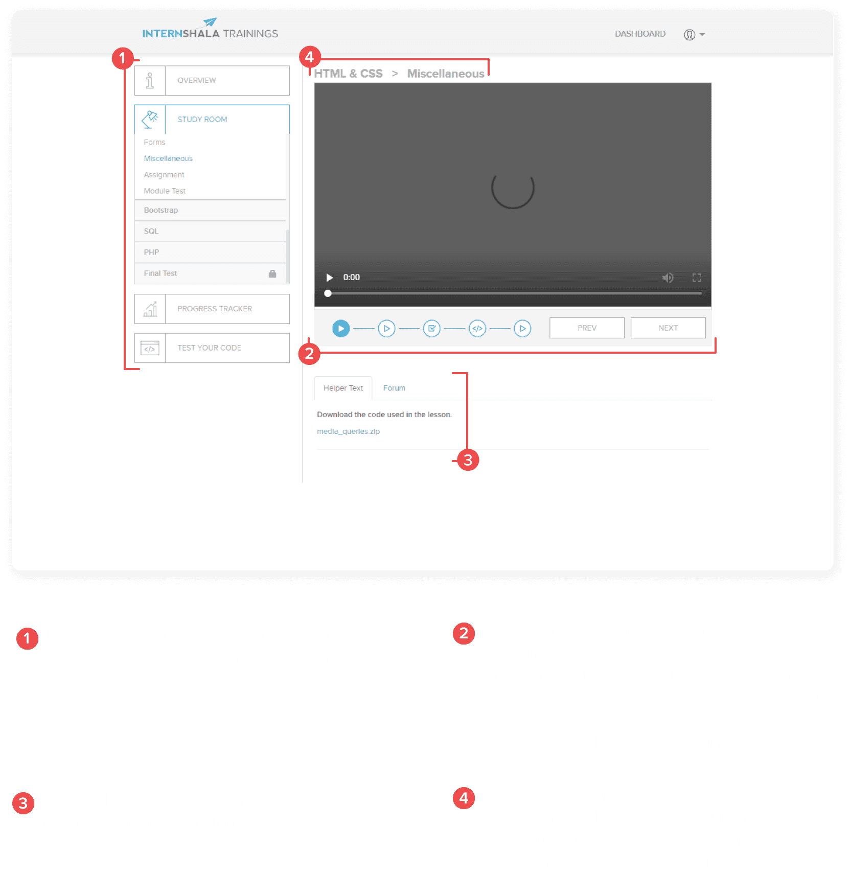
Difficulty navigating between video lessons, text content, and modules
Unclear sense of progress through a course
Confusion around what to do next after finishing a lesson
Drop-offs during longer courses, especially after breaks
The learning experience worked functionally, but did not adequately support students while consuming course content over time.
Key challenges included:
Learning sessions were frequently interrupted, but the system didn’t support resuming smoothly
Progress existed, but wasn’t visible or motivating
Navigation required context-switching between modules, topics, and content
Learners lacked a clear sense of “what’s next” after each step
As a result, many students disengaged mid-course despite enrolling with clear intent.
Context & Constraints
The platform served students and very early career professionals learning alongside college or work
Learning sessions were short, interrupted, and resumed across devices
Course structure, curriculum, and content were already defined
The experience needed to support video-first learning with supporting text
The redesign focused on improving content consumption and continuity without altering course material
These constraints meant the focus was on improving navigation, clarity, and motivation within the existing learning structure.
Users & Goals
Primary Users
Students and early career professionals enrolled in skill-based online courses
User Goals
Navigate lessons and modules easily
Understand progress across the course
Resume learning quickly after interruptions
Stay motivated through longer learning journeys
Complete courses with confidence
Insights
Students often stopped after completing a video due to unclear next steps
Progress felt abstract when spread across multiple lessons and formats
Interruptions made it harder to regain momentum
Visual feedback increased confidence more than reminders or instructions
Clear structure mattered more than visual novelty
The biggest blocker wasn’t information overload — it was uncertainty about what to do next
Design Strategy
Mental Model Shift
From “content consumption” → “guided progression”

The strategy was to reduce cognitive effort required to continue learning so motivation didn’t depend on willpower.
The solution focused on three principles:
Make learning progress visible during content consumption
Reduce friction between lessons, videos, and modules
Design for interrupted, real-world learning behavior
This meant treating the LMS as a guided learning journey, not just a content viewer.
Key Design Decision
Decision 1: Structured Lesson Navigation
Why:
Students needed a clear sense of where they were within the course.
Tradeoff:
Reduced flexibility in free exploration to maintain continuity.
Decision 2: Progress Indicators Across Content
Why:
Visible progress reinforced motivation during long courses.
Tradeoff:
Introduced additional UI elements that required careful hierarchy.
Decision 3: Clear “What’s Next” Guidance
Why:
Uncertainty after completing a lesson caused drop-offs.
Tradeoff:
Limited optional branching to preserve momentum.
Decision 4: Resume-Friendly Content Flow
Why:
Most students returned to learning after pauses or interruptions.
Tradeoff:
Prioritized continuity over deep content browsing.
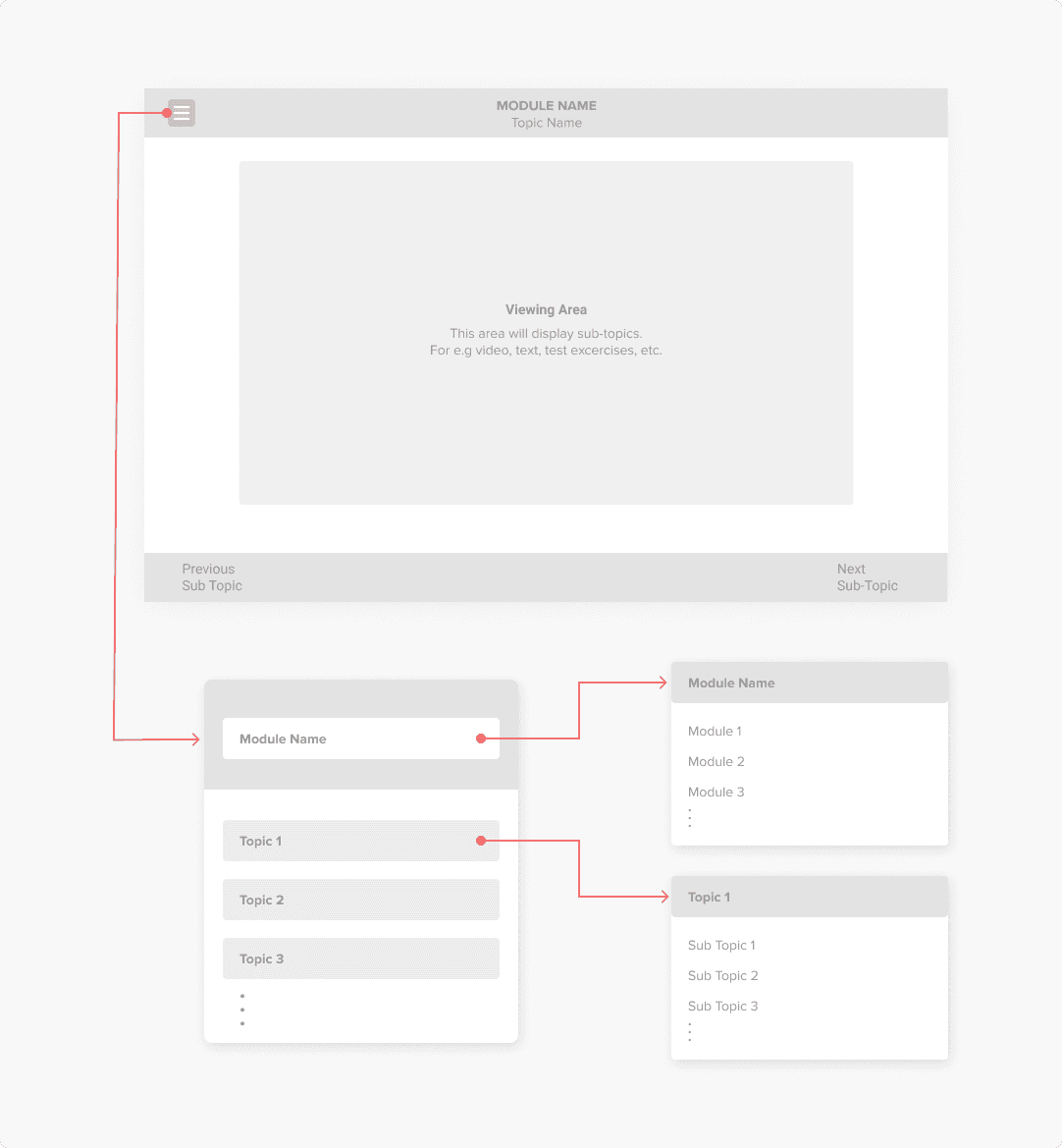
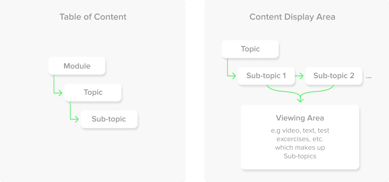
After identification of different elements and classifying them into groups, wireframes were made to incorporate them visually with their interactions
Visual System

Solution Overview
Made progress visible at every step
Allowed learners to resume seamlessly after interruptions
Reduced navigation effort by unifying content and controls

Metrics Moved
Impact at a glance
Course completion rate increased by 12%
Reduced student drop-offs during mid-course stages
Improved clarity and confidence while consuming course content
These improvements were driven primarily by reducing navigation friction and making progress visible at every step not by adding new content.
Learnings & Reflection
Learning experiences must design for interruption, not ideal behavior
Progress visibility is a stronger motivator than content volume
Small UX improvements can significantly affect completion outcomes
If revisited, I would explore adaptive pacing based on learner behavior
This project reinforced that systems that reduce decision fatigue outperform systems that merely organize information.

