Prime Video — Revamp
Industry
Streaming Media
Org
Amazon
Role
Self-initiated UX exploration
Team members
N/A
Redesigned the Prime Video player experience to enable smoother episode navigation, quicker access to seasons and show details, and better continuity during long viewing sessions.
My Role
UX exploration, interaction design, and usability-driven improvements for the video player experience.

Problem
Users watching episodic content struggled to:
Navigate between episodes and seasons efficiently
Access show details without exiting playback
Resume context after interruptions
The player optimized for “watching”, but not for continuing.
Key challenges included:
Users watching episodic shows often needed to:
Browse seasons
Select episodes
Understand what’s next
but doing so required exiting the player, breaking immersion and increasing friction.
On mobile, the challenge isn’t finding the next episode — it’s getting there without breaking the moment.
Context & Constraints
The video player primarily serves mobile users watching episodic content on the go
Viewing sessions are often interrupted, requiring quick resumption and continuity
Screen real estate is limited, with content needing to remain the primary focus
Playback performance and responsiveness are critical on mobile networks and devices
The exploration focused on improving in-player navigation and continuity without backend or content-model changes
When people are watching a show, they’re not looking to navigate, they’re looking to continue.
Users & Goals
Primary Users
Binge watchers
Casual viewers returning mid-series
User Goals
Reduce friction between episodes
Enable quick access to seasons and details
Preserve immersion while adding control
Insights
Analysts frequently replayed the same segment multiple times to capture context
Important moments were often missed due to lack of visual cues
Switching between playback, transcription, and notes broke focus
Speed controls and keyboard shortcuts were more valuable than visual polish
Analysts wanted to stay “in the flow” while reviewing calls
These insights shaped every design decision that followed.
Design Strategy
The solution focused on three principles:
Treat the player as a continuation surface, not just a playback tool
Surface navigation context only when needed
Prioritize mobile-friendly interactions
Key Design Decision
Decision 1: Persistent Episode Navigation
Why:
Seasons are a mental model, not metadata
Tradeoff:
Required careful hierarchy to avoid clutter.
Decision 2: Contextual Season Switcher
Why:
To eliminate context switching between tools.
Tradeoff:
Required careful hierarchy to avoid overwhelming users.
Decision 3: Inline Show Details
Why:
Reduce page switching.
Tradeoff:
Limited information depth by design.
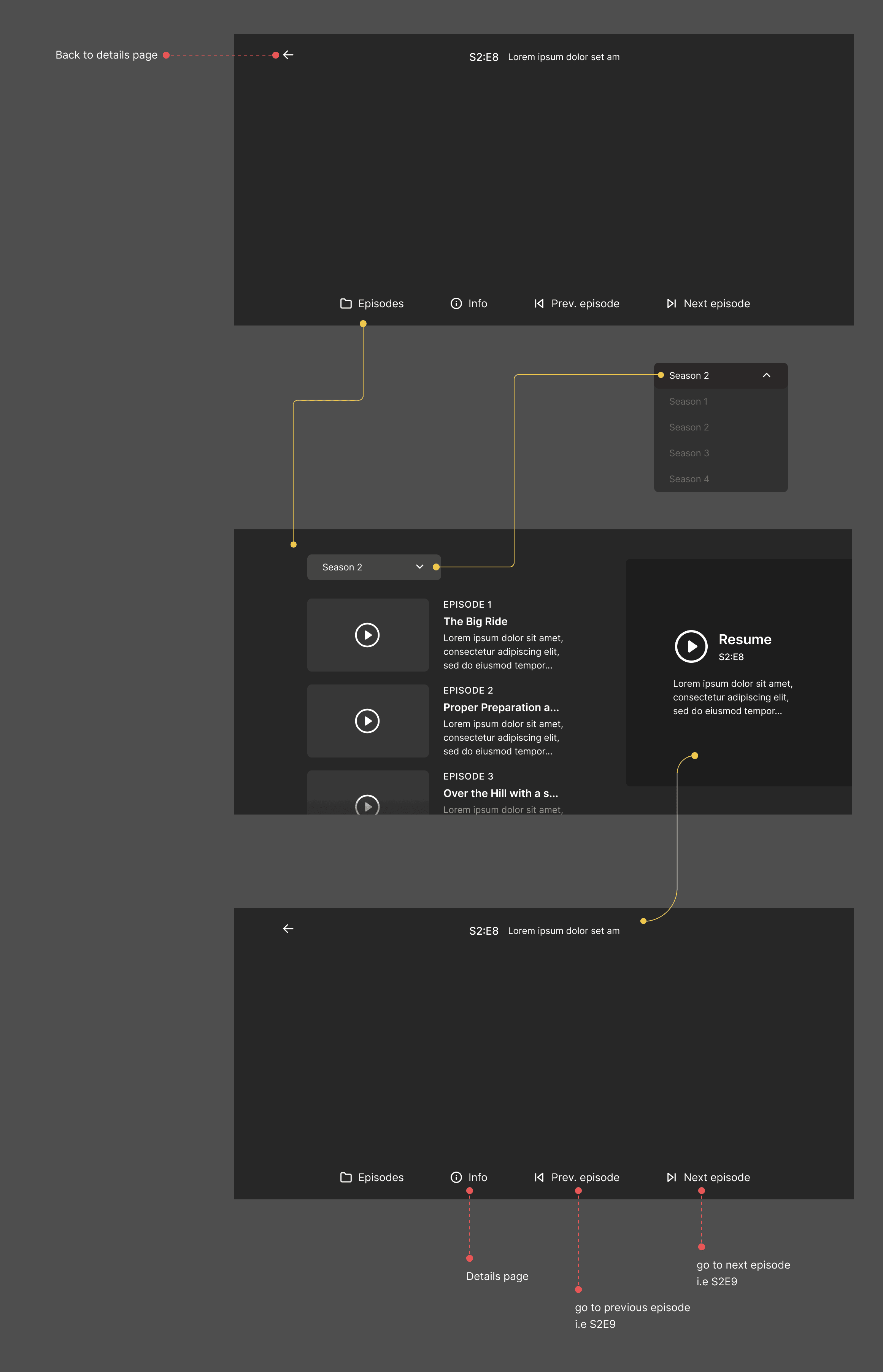
Wireframe
To validate the interaction model before visual design, I created a low-fidelity wireframe focusing only on navigation hierarchy, episode continuity, and control placement.
This helped ensure the player supported continuation rather than just playback, without introducing visual or cognitive noise.
Solution Overview
Inline episode & season navigation
Context-aware controls that adapt to viewing state
Reduced dependency on exiting the player
Impact (Conceptual / UX Outcomes)
Reduced cognitive load during long viewing sessions
Improved continuity for episodic content
Clearer sense of progression and control
Learnings & Reflection
Even “simple” players hide complex user expectations
Continuity matters more than choice during consumption
Good player UX disappears when done right

